These 6 exterior color ideas range from a quiet one-color job on a small ranch to a full three-layer Victorian scheme, and the right choice depends on how much architecture your house already shows.
A plain facade needs contrast to survive; one with brackets, bays, or thick Craftsman trim can carry more restraint.
Dark blue with white frames is one of those colors that punishes lazy prep: the pigment catches every bump in old wood, so most of your weekend goes to sanding and filling, not to buying extra gallons.
[link-whisper-related-posts]1. Victorian Bright Colors
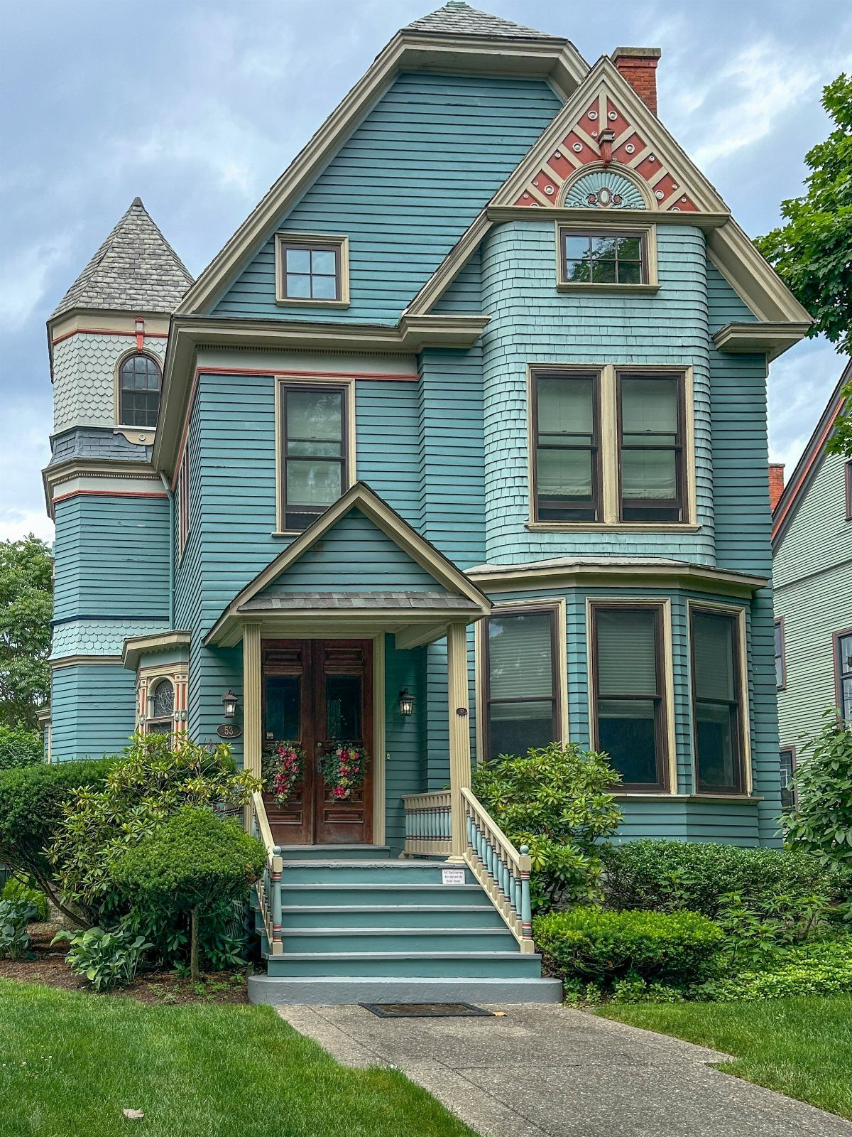
Victorian bright colors are not one safe choice but three or four, painted where the architecture already breaks itself into layers.
The body gets one color, the trim another, the brackets and gables a third that actually reads against the second.
This suits a reader who owns an older house with the millwork left to show off, or who is willing to add it.
Victorian bright color schemes often pair a vivid body color with contrasting trim and an accent hue that do not blend; they argue a little, which is the point.
If your house is simpler, the same palette works with one color dropped out.
A plain gable-front Victorian can carry 2 colors plus a door. The risk is not clashing but timidity; a half-measure Victorian reads as a mistake rather than a choice.

ALL SEASON PAINT & PRIMER-IN-ONE: Cascadia XL is a 100% Acrylic Latex Paint & Primer-in-One with advanced technology for rain protection and a superior finish
ALL-IN-1 PAINT & PRIMER: A hardy multi-purpose and multi-surface one-coat paint and primer in one for almost any indoor or outdoor surface. A wall, ceiling, floor, skirting board, cabinet, furniture and door paint for your bathroom, kitchen, home and garden.
ALL-IN-1 PAINT & PRIMER: A hardy multi-purpose and multi-surface one-coat paint and primer in one for almost any indoor or outdoor surface. A wall, ceiling, floor, skirting board, cabinet, furniture and door paint for your bathroom, kitchen, home and garden.
2. Mid-century Modern Colors
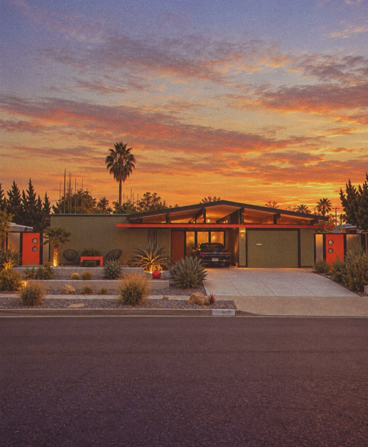
Mid-century palettes pull from the era’s actual materials: olive paint against orange that echoes terracotta block, or mustard trim on grey-brown siding that nods to raw cedar.
Olive walls with orange gates only works because both colors are slightly dulled, neither one shouting.
The reader working with a ranch or a split-level from that era already has the right bones. Flat planes, low slope, carport or carport-style overhang: these are what the color is painting, not covering up.
Earth tones matter more than exact matches.
A period source might list specific shades, but the rule is that nothing goes fully saturated. Even the orange stays dusty.
If you are unsure, hold the sample against brick, against concrete, against whatever hardscape will stay. The color that looks slightly wrong indoors often settles in outside.

Playful mid-century modern cat trio sticker perfect for laptop exteriors.
Playful mid-century modern cat trio sticker perfect for laptop exteriors.
Playful mid-century modern cat trio sticker perfect for laptop exteriors.
3. Light Blue-Grey with White Trim
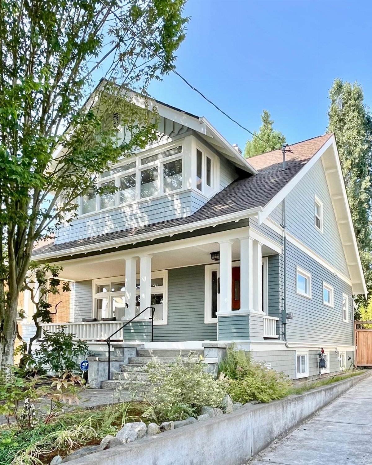
Light blue-grey with white trim is the safest entry on this list, which means the decision is not whether to try it but how to keep it from washing out.
The craftsman has weight: thick columns, a broad porch rail, trim boards with actual dimension.
On a house with thinner trim or narrower windows, the same pairing can go flat. The fix is often to darken the body color by half a step, or to add a third color at the door.
White here is not absence but contrast.
Check the trim width before you commit; skinny window casings may need to be built out or painted to match the siding so the white does not stripe the facade. The porch columns carry enough mass to hold their own.

Great for wood siding, trim, decks, fences, and interiors

IMPROVES PAINT BONDING: Boosts paint grip on difficult surfaces including tile, granite, concrete, metal, glass, painted, varnished, and lacquered finishes, creating a durable base that helps reduce peeling and chipping.

MILK PAINT FOR FURNITURE & DECOR: Boxwood, Pint is ideal for painting furniture, cabinets, home décor, and medium-sized DIY refinishing projects. Creates a beautiful soft matte finish with classic farmhouse character.
4. Dark Blue with White Frames
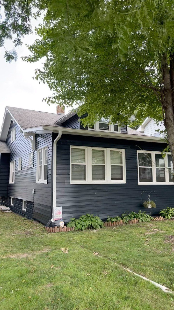
Dark blue with white frames asks more of prep than of paint choice. The color is only as good as what is under it; dark pigment shows every bump and gap.
A single-story house keeps the scale human, which helps.
The white windows read as openings punched through a solid surface rather than as trim applied on top. Gutters painted white to match continue that reading.
On a house with replacement windows already white, this is nearly a one-color job. The body goes dark, the frames stay as-is.
The cost stacks up in surface prep on old wood, not in gallons. If your soffits are vinyl or already smooth, you skip the worst of it.

CONVENIENT SIZE - This Apple Barrel Acrylic Paint comes in a versatile 2 oz size that is great for basecoating, stenciling, and so much more

CONVENIENT SIZE - This outdoor acrylic paint set includes 16 - .1667 fl oz paint pots as well one brush. The colors in this paint set include: Delta Outdoor Royal Blue, Sky Blue, Light Blue, Pink, Purple, Terra Cotta, Brown, Black, Dark Green, Light Green, Turquoise, Magenta, Light Brown, Red, Yellow and White

5. Monochromatic Sage Green
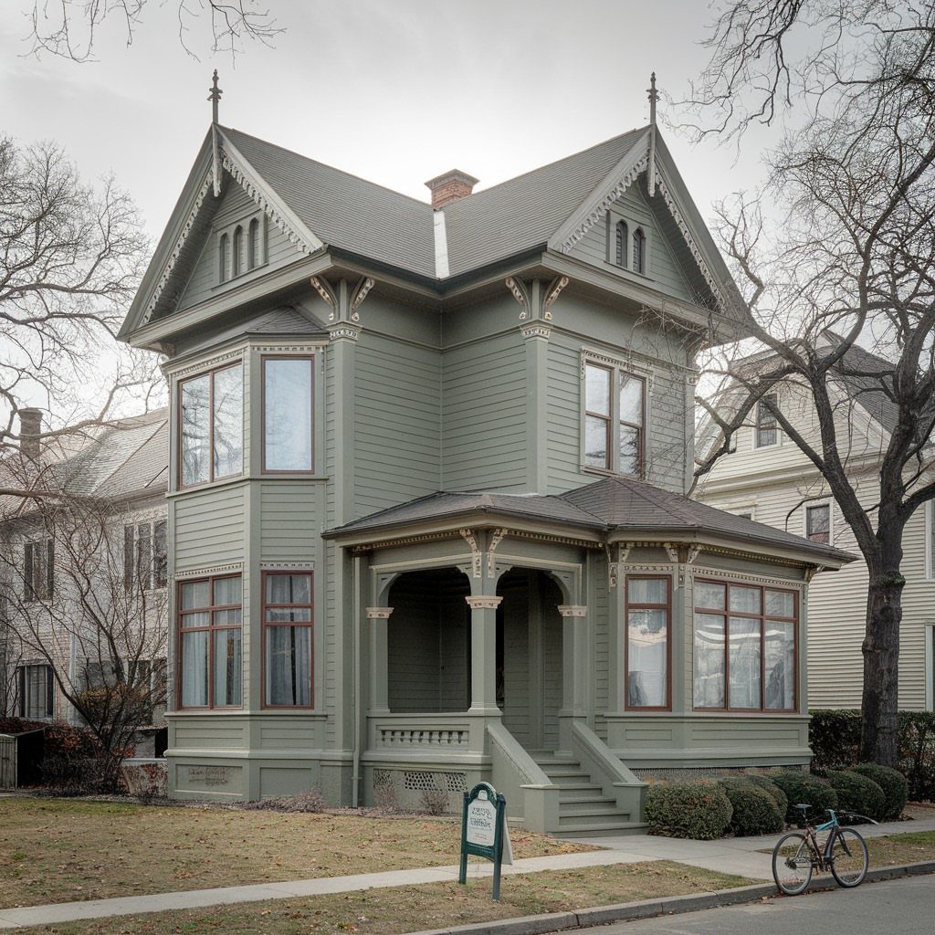
Monochromatic sage green works on a house with enough ornament to survive the quiet.
The Victorian has bay windows, porch scrollwork, roofline brackets; the single color lets those shapes read without competition. Dark trim at the windows adds just enough separation to keep the face from going soft.
The reader with a plainer house risks making it plainer still. Before trying this, check whether your facade has enough variation in depth, in texture, in shadow line, to hold interest without color to carry it.
A flat front, a simple gable, a single door with no porch: these may need a second tone or at least a door painted to contrast.
Sage reads differently across the day, greener in morning light, greyer as the sun drops. Sample it on the north side if you can, where it will live most of the time.

LOW ODOR TECHNOLOGY: Premium paint with 40% lower odor than traditional Rust-Oleum spray paint without sacrificing the quality of the paint finish

*Prestige Paints has created a comparable color based on color specifications of the original color using industry leading technology.

Ideal for use on interior/exterior surfaces including wood, plastic, plaster, metal, masonry and unglazed ceramic
6. Sage Green Trim and Doors
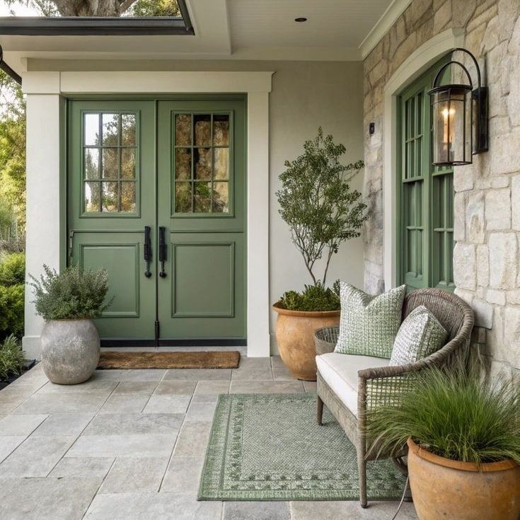
Sage green trim and doors on stone is a smaller commitment than a full body color, and the stone does most of the work.
Double doors, window shutters, and painted wood trim read against a wall that is not painted at all.
Stone varies. The tones in your wall, warm or cool, decide whether a given sage leans too yellow or too blue.
Hold the sample against the actual stone, not a photo of it, and check at the hour you usually come home. The match that reads in morning light can shift by evening.
Shutters and a door are replaceable if the color fails. That is the practical advantage here.
Paint them first, live with them for a season, then decide whether to carry the color to other trim or let it stay where it is. The door is enough on its own.
Playful mid-century modern cat trio sticker perfect for laptop exteriors.
Playful mid-century modern cat trio sticker perfect for laptop exteriors.
Playful mid-century modern cat trio sticker perfect for laptop exteriors.